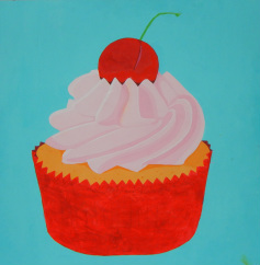
My painting of a cupcake got some really good feedback, which was pleasing to hear. Everyone seemed to like the bold, bright colors and the block shading I used instead of gradient shading. It sort of has a pop-art kind of style to it, which I'm starting to love more and more.
One of the major things I wish I had incorporated is a word. I mean, this painting was really just experimental. I wanted to see how working larger and with more color would work for me, so I didn't really want to spend time trying to work a message into it. Also, time didn't really allow for that this time either.
Other than that, though, I'm really happy with these results. I'm definitely going to keep working in this direction. Ideas for my next project include French pastires and
 RSS Feed
